Introduction
If you ever need to simulate a real-world system or generate random data that resembles the real one, then you will likely have to sample a random variable with a given probability distribution.
In this article, we show how we can do this in Crystal, using an ensemble of libraries that will make our life easier and help us visualise the patterns behind the numbers.
Sampling from a Normal distribution
Normal distributions are ubiquitous in nature and in data, so let’s take one of those to practice. First, let’s use the statistics package to define a normal distribution with the desired mean and standard deviation.
normal = Normal.new(mean: 0.8, std: 0.2)
We can now sample values from a random variable with such distribution by calling normal.rand, or even build an arbitrarily large sample as follows.
size = 10000
sample = (0...size).map { normal.rand }
We can also describe the sample to inspect its descriptive statistics and verify our expectations.
info = Statistics.describe(sample)
The function returns a NamedTuple where the keys are the summary statistic coefficients. This makes it easy to iterate over the values and display the information in tabular format, for better readability. Here is a sample output I’ve built using tablo.
+--------------+--------------+
| mean         |        0.802 |
| var          |         0.04 |
| std          |          0.2 |
| skewness     |       -0.039 |
| kurtosis     |        2.921 |
| min          |        0.066 |
| middle       |        0.795 |
| max          |        1.524 |
| q1           |        0.671 |
| median       |          0.8 |
| q3           |        0.938 |
+--------------+--------------+
Notice how both the mean and std of our sample match the ones of our population. This is more likely to be the case the larger your sample size is. We can take our examination a bit further, and observe that both skewness and kurtosis also approximate the expected values for a normal distribution - zero and 3, respectively.
Let’s get visual
OK, tables are great, but how about we plot a histogram of our sample, to get a qualitative feel for it. To build a histogram, we need to perform an operation called data binning, i.e. to split and count the sample’s values into bins - of equal size, in this case. We can achieve this by calling Statistics.bin_count.
bins = 100
sample_bins = Statistics.bin_count(sample, bins: bins, edge: :centre)
The option edge: :centre tells the function to compute the centre of each bin edge. That’s what our graphics library expects - rather than their vertices - when drawing boxes.
The returned object exposes the bin counts, the edges and the step size computed based on the number of bins.
Preparing the data for visualisation is now trivial:
x = sample_bins.edges
y = sample_bins.counts
We’ll be plotting our data with Ishi, a Crystal graphing package powered by Gnuplot.
Here is how we can plot the histogram with some decorations: a legend (title), a plotting style, a fill-style (fs) and x / y labels.
Ishi.new do
  plot(x, y, title: "sample \\~ N(0.8, 0.04)", style: :boxes, fs: 0.25)
    .xlabel("value")
    .ylabel("frequency")
end
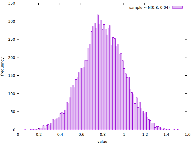
A histogram showing the frequency of the values sampled from a random variable with probability distribution N(0.8, 0.04).
Notice how the shape of the histogram resembles the one of a normal curve. Let’s qualitatively check that the distribution of the sample approximates the one underlying the random variable that generated it. We can do so by overlapping the corresponding normal distribution probability density function (PDF) to the histogram.
Remember that the integral of a PDF is 1, whereas the histogram we’re looking at represents the absolute count of sample’s values falling in each bin. To address this, we’ll normalise the bin count by dividing each value by the histogram area.
area = size * sample_bins.step
normalized_y = y.map &./(area) # shorthand syntax

pdf = x.map { |x| normal.pdf(x) }

Ishi.new do
  plot(x, normalized_y, title: "sample \\~ N(0.8, 0.04)", style: :boxes, fs: 0.25)
    .xlabel("value")
    .ylabel("frequency")
  plot(x, pdf, title: "N(0.8, 0.04)", lw: 2, ps: 0)
end
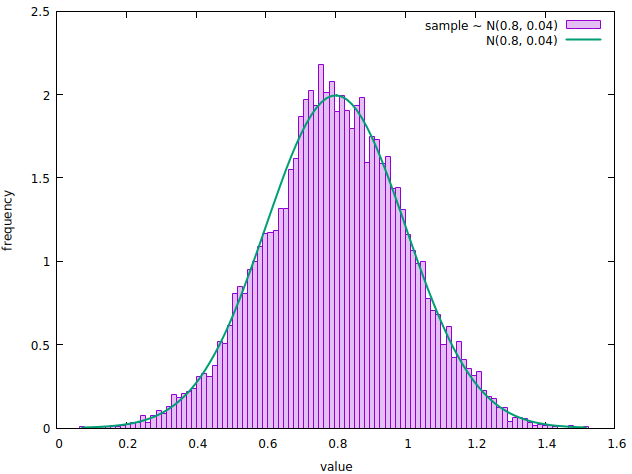
A normalized histogram showing the frequency of the values sampled from a random variable with probability distribution N(0.8, 0.04), overlapped with the PDF of the same normal distribution.
This concludes our brief tour of statistics and ishi. You can find a working version of the code we discussed on github. I’ve also included an example where we sample from a random variable with exponential distribution, to spice things up.
What now?
So far, we’ve seen two things:
- how we can sample values from random variables with a given distribution
- how we can use descriptive statistics and visualisation tools to explore a dataset
In the next article, we’ll put the two together: first, we’ll generate a real-world-like dataset representing user visits on a website, then we’ll run some simple analysis and visualisation on the data. Stay tuned!
References
- A working version of the code we saw can be found here.
- We used statistics to draw samples from a random variable, compute summary statistics and perform data binning on a dataset.
Full disclosure: I am the shard’s author. - We used tablo to print data in tabular format.
- We used Ishi to plot histograms. On the topic of data visualisation, you might also want to check out Aquaplot. Both shards are powered by Gnuplot and offer similar functionalities.
- Python Histogram Plotting by realpython.com was a valuable source of inspiration and reference for this article.
- Wikipedia was used as the main reference for the statistical content in this article.
Thanks for reading, I hope you found this useful. You can share your experiences with Crystal and statistics in the comments section below.